Case study
Madan AgroFarms & Resorts: Under the banyan, time slows down.
Madan AgroFarms & ResortsHospitality and agriculture: a private farm resort with farm produce in Odisha, India
Brief
The brief.
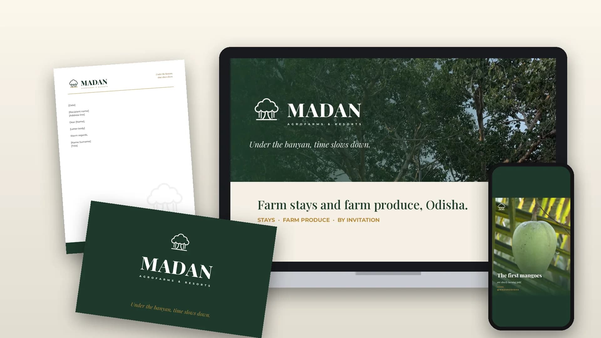
Madan AgroFarms & Resorts needed a new identity for two offers under one name: quiet farm stays and the fruit, rice and vegetables grown on the land. The brand had to work across very different places, including a gate sign, stationery, social media and a round mango label, and stay clear and recognisable down to a browser tab. The resort is private for now, with visits by invitation, so the identity also had to feel welcoming without feeling like a hotel ad.
Approach
Our approach.
The idea behind the logo: the banyan
A banyan grows slowly, shelters everyone beneath it and puts down new roots as it spreads. That made it the natural symbol for a farm that offers both hospitality and harvest. We drew it as a line-art tree standing on a gold ground line, above the MADAN wordmark and the AGROFARMS & RESORTS subline. The canopy stands for shelter and hospitality, the aerial roots for being rooted in the land, and the gold line for the soil itself.
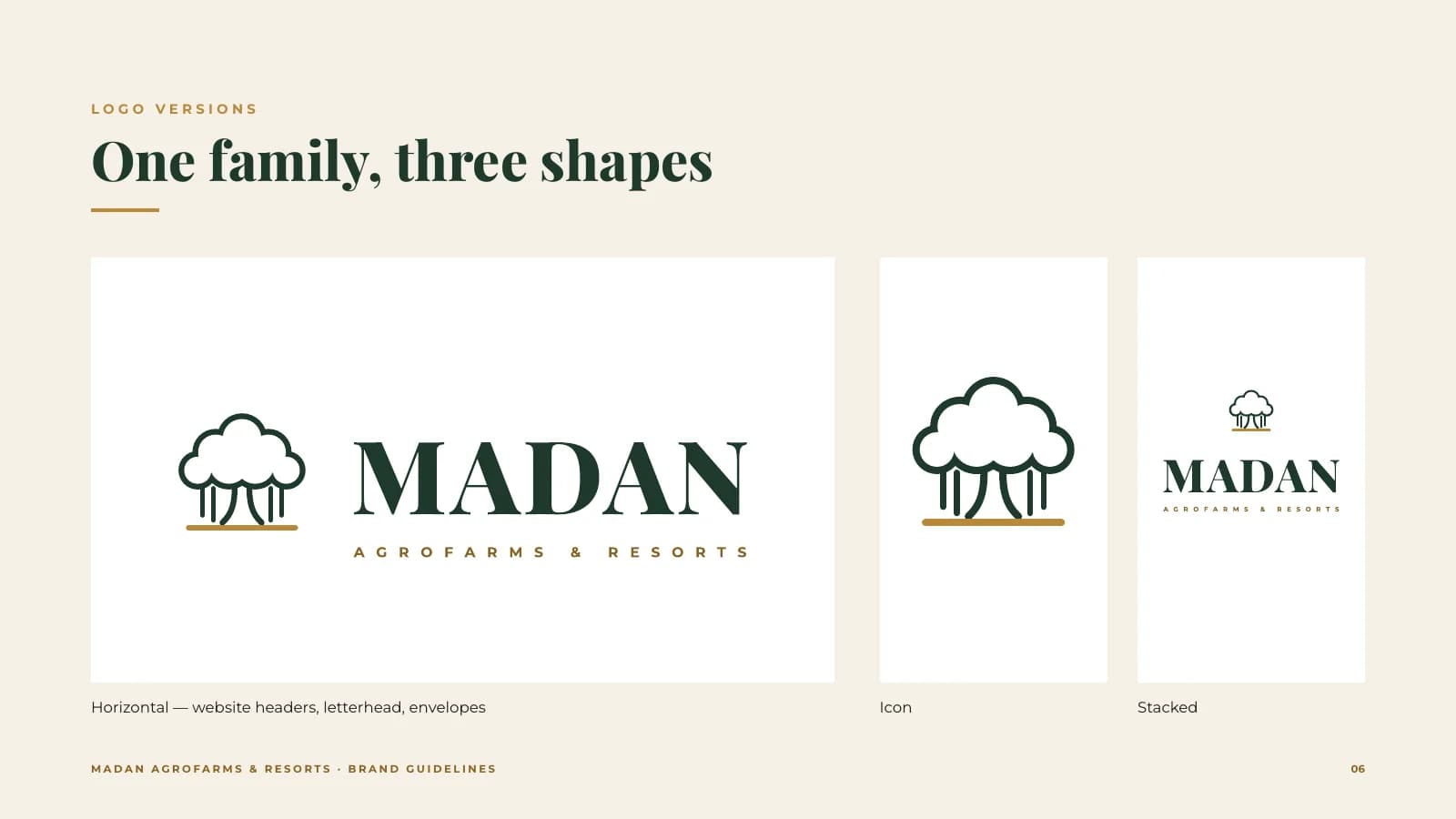
One family, three shapes. Horizontal, stacked and icon versions cover everything from letterhead to signage. For 16–32 px we drew a simplified tree with a solid canopy, so the mark stays crisp as a favicon.
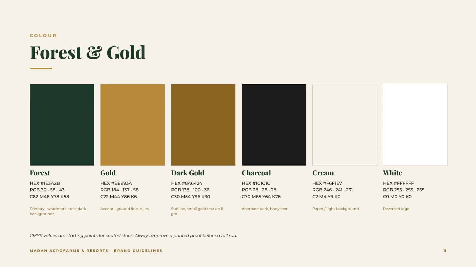
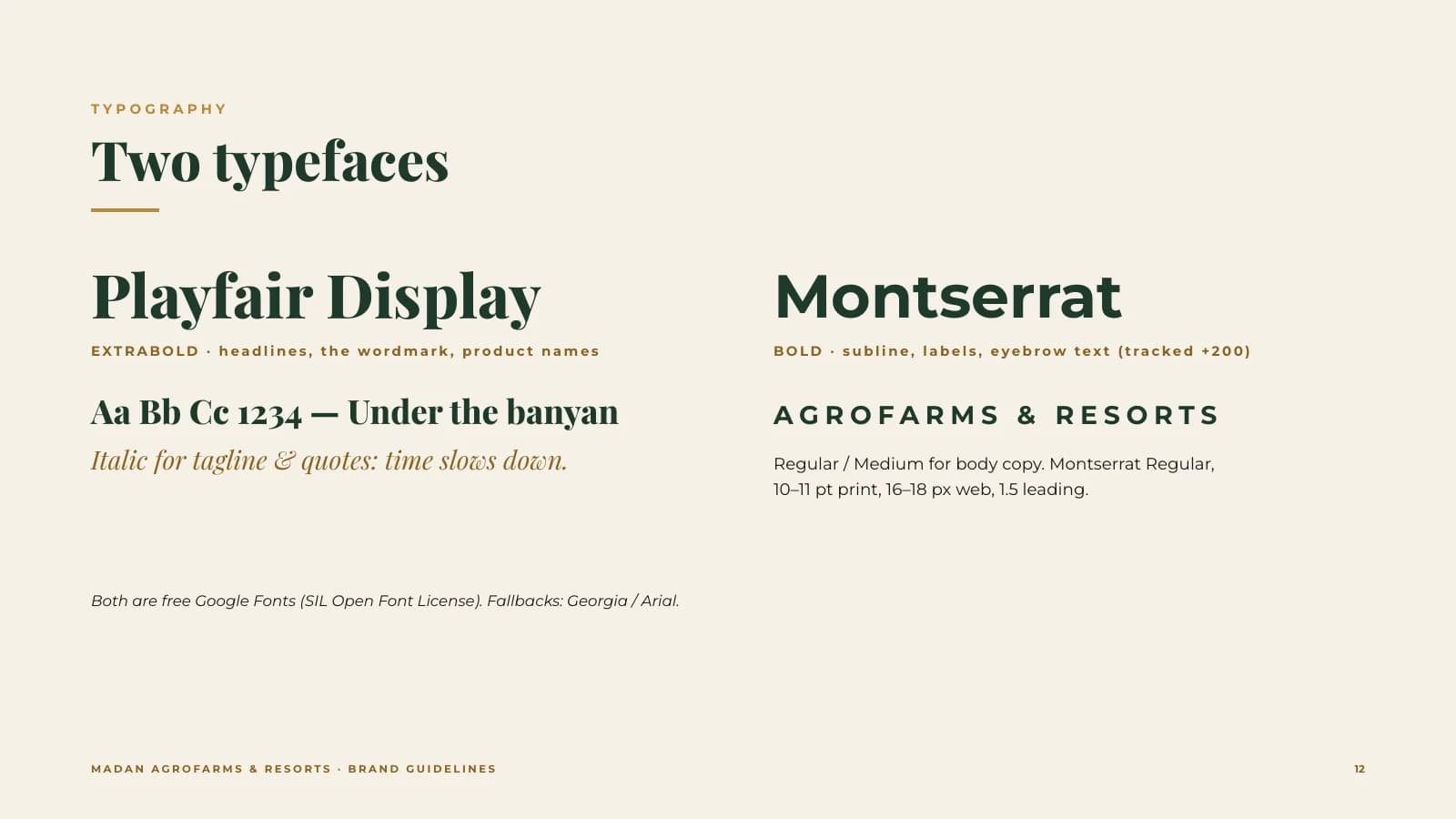
Colour, type and voice. The "Forest & Gold" palette pairs Forest (#1E3A2B) with Gold (#B8893A), supported by Dark Gold, Charcoal, Cream and White. Playfair Display brings warmth and character to headlines, and Montserrat keeps labels and body text clean. The voice is warm, unhurried, rooted and honest, summed up in the tagline "Under the banyan, time slows down."
Deliverables
What we delivered.
19-page brand book
Logo package
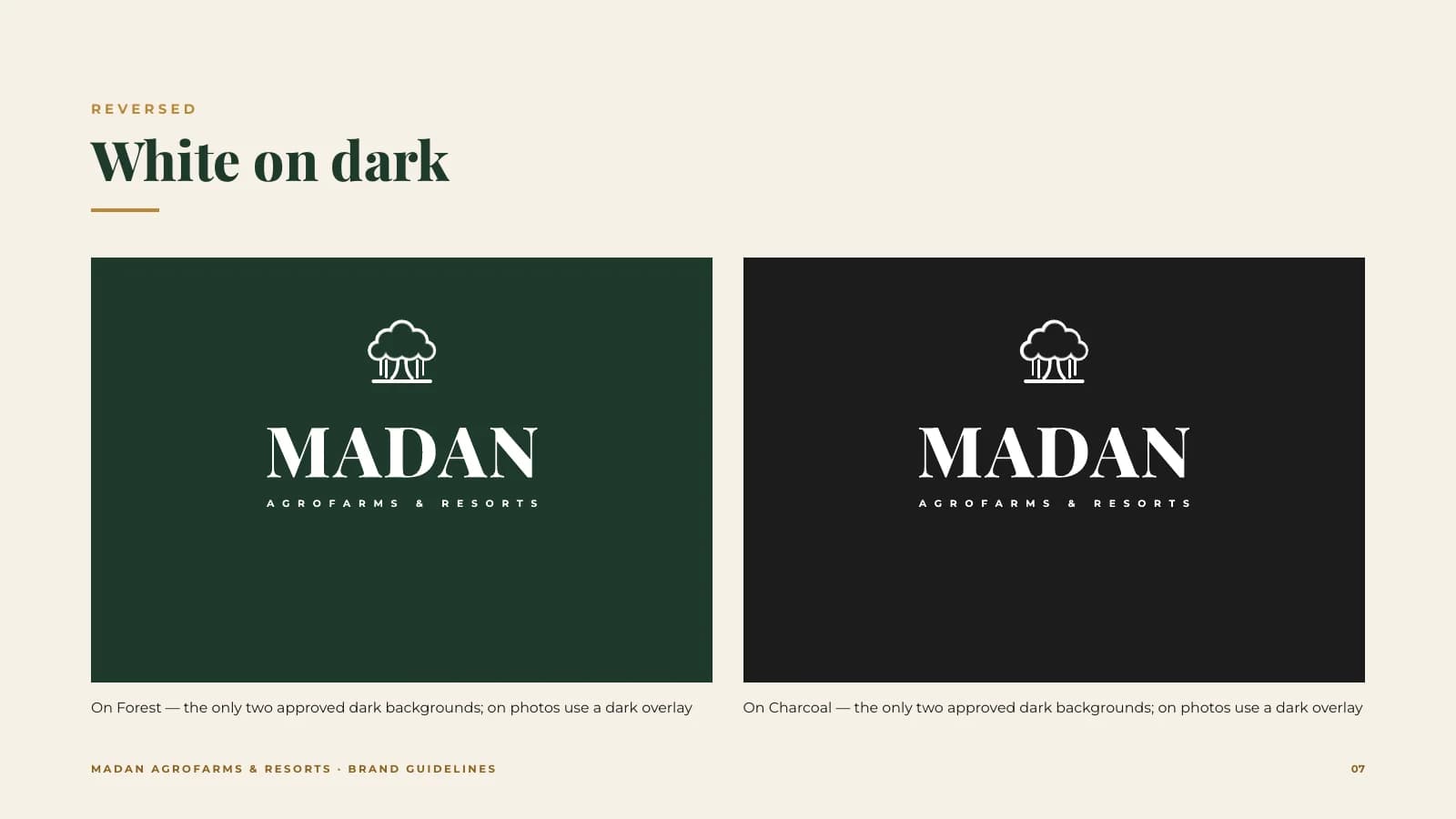
Horizontal, stacked, icon and small icon in 4 colourways (colour, on Forest, on Charcoal, white reversed), in SVG, PNG and PDF
Favicon set
14 files
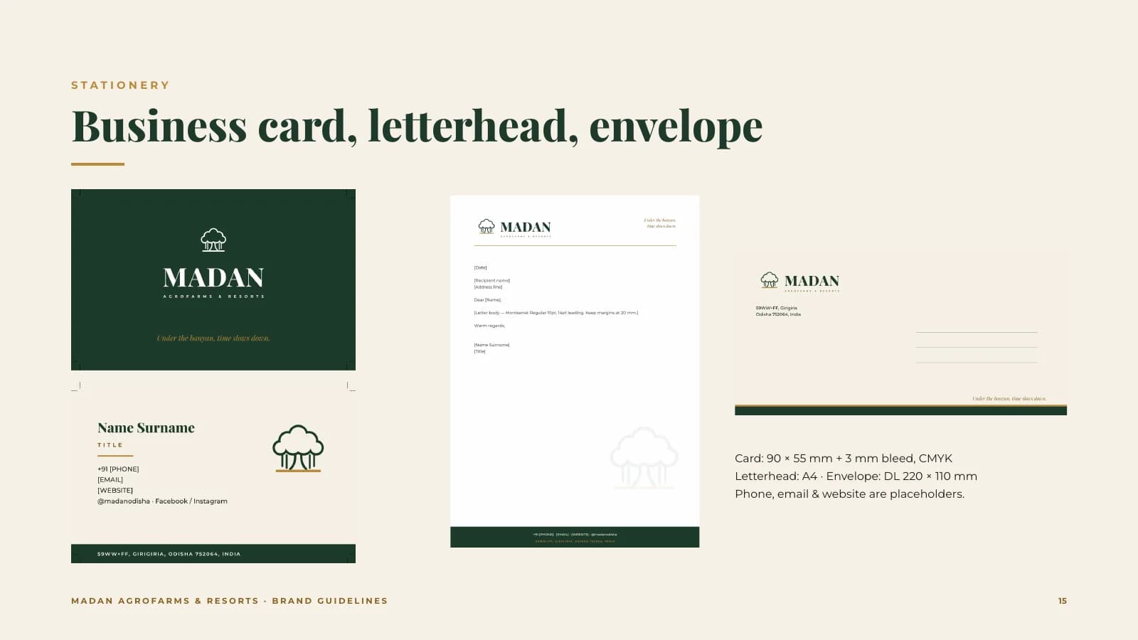
Business card (front and back, CMYK with bleed), A4 letterhead and DL envelope
Social kit
7 designs (Facebook cover, 3 Instagram posts, 2 stories, profile image)
Gate signage (900 × 750 mm) with mockup
Produce labels
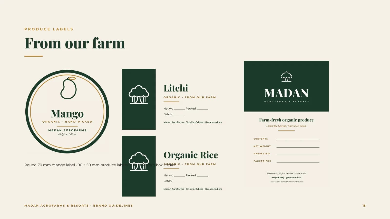
Round mango label, 3 produce labels (litchi, custard apple, organic rice) and a box sticker
More work
Related brand identities.
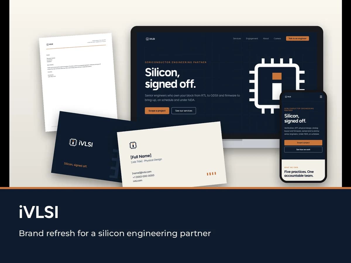
iVLSI
A brand refresh for a semiconductor engineering services company, built around the Die mark: a lowercase "i" inside a chip outline. Brand book, logo system, stationery and a website redesign.
Read the case study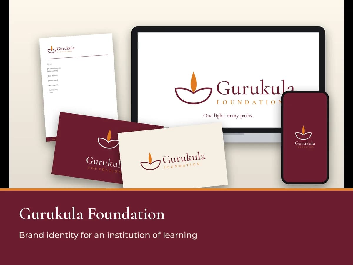
Gurukula Foundation
A new identity for an institution where engineering, nursing and management students learn under one roof, built around a diya drawn in one continuous line. Brand guidelines, logo package and web kit.
Read the case study
Next step
Launching something new.
We'll give it a complete identity from day one, from the logo to the labels. Tell us what you're building.