Case study
iVLSI: Silicon, signed off.
iVLSISemiconductor engineering services (ASIC design and verification, DFT and physical design, analog layout, embedded firmware)
Challenge
The challenge.
iVLSI does serious engineering work, but its brand didn't show it. The colours were mostly a web framework's default blue and navy, with stray purple and orange, and the only typeface was DM Sans. The logo existed as a single PNG, with no vector, reversed or one-colour versions.
The message was split too. The home page listed six services and the services page listed nine, including manpower and staffing, which made the company read like an agency. Blog Q&A, forum and job-board links gave it the feel of a learning site.
The brief was a refresh, not a rename: keep the name iVLSI and make the brand look and sound like the partner chip teams trust with their tape-out.
Approach
Our approach.
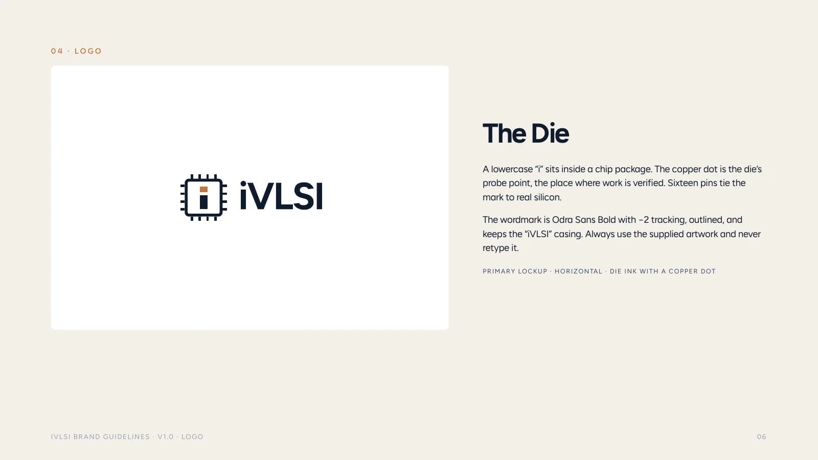
The idea behind the logo: the Die
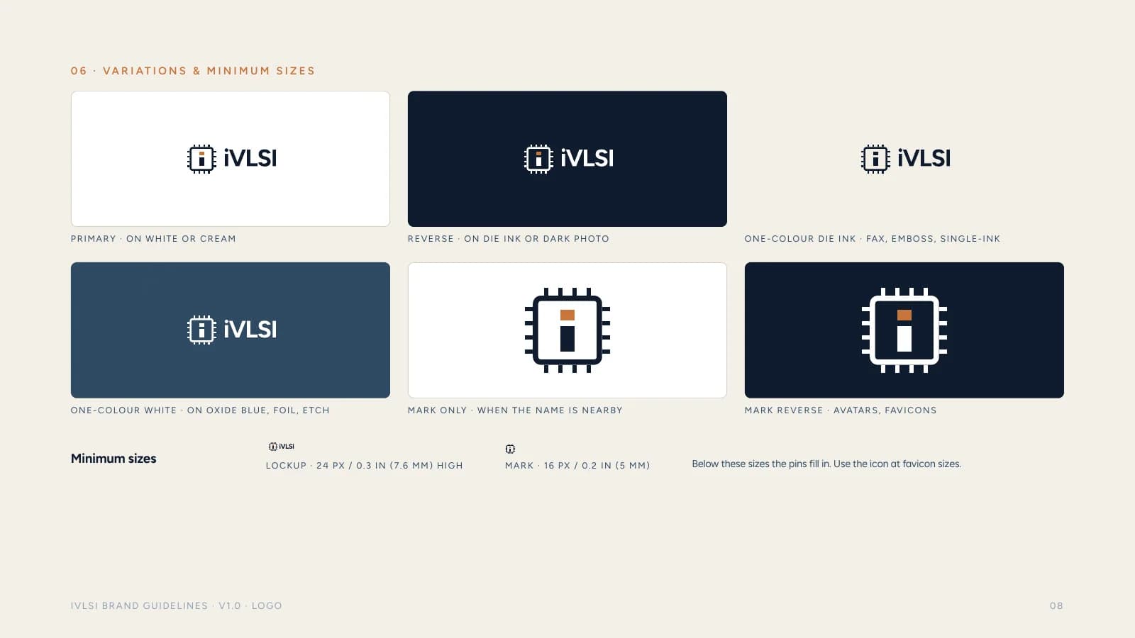
The lowercase "i" from the iVLSI name sits inside a chip outline. It turns the most distinctive letter in the name into the mark, and because it's built like a chip, it still reads as one at small sizes, from favicons to social avatars.
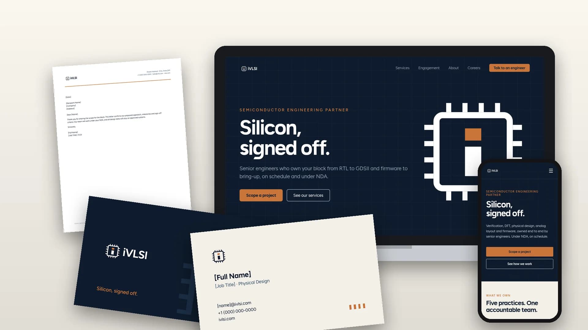
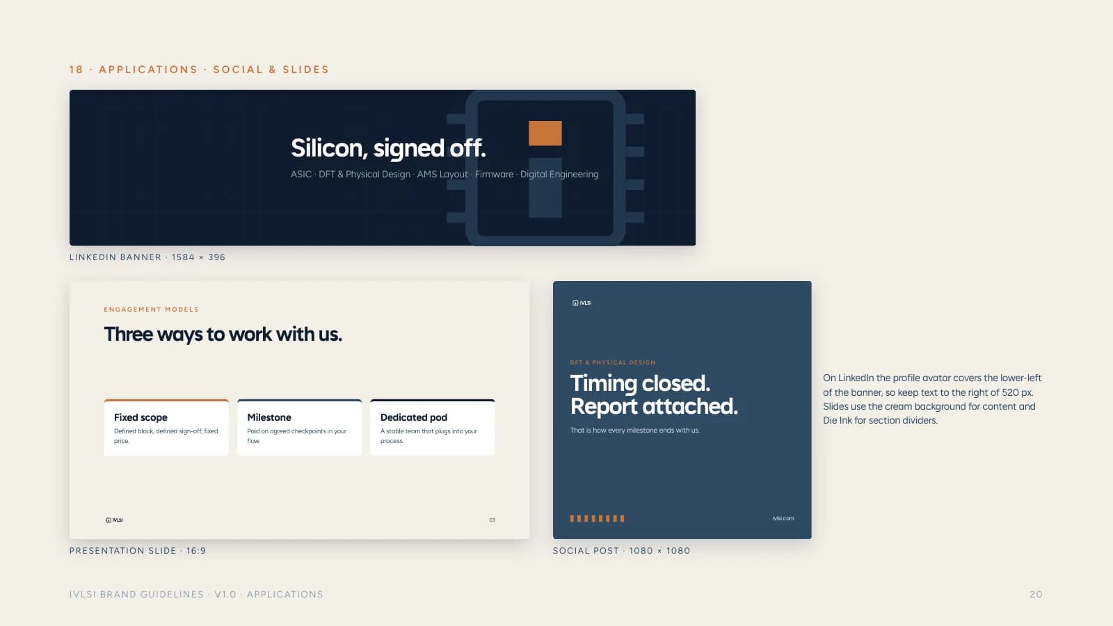
Strategy first. We repositioned iVLSI as a silicon engineering partner, not a staffing firm or an education site, and gave it a line that says exactly that: "Silicon, signed off." The services were consolidated from nine into five clear pillars.
Three directions. We explored three identity concepts: Die, Signal Path and Wafer.
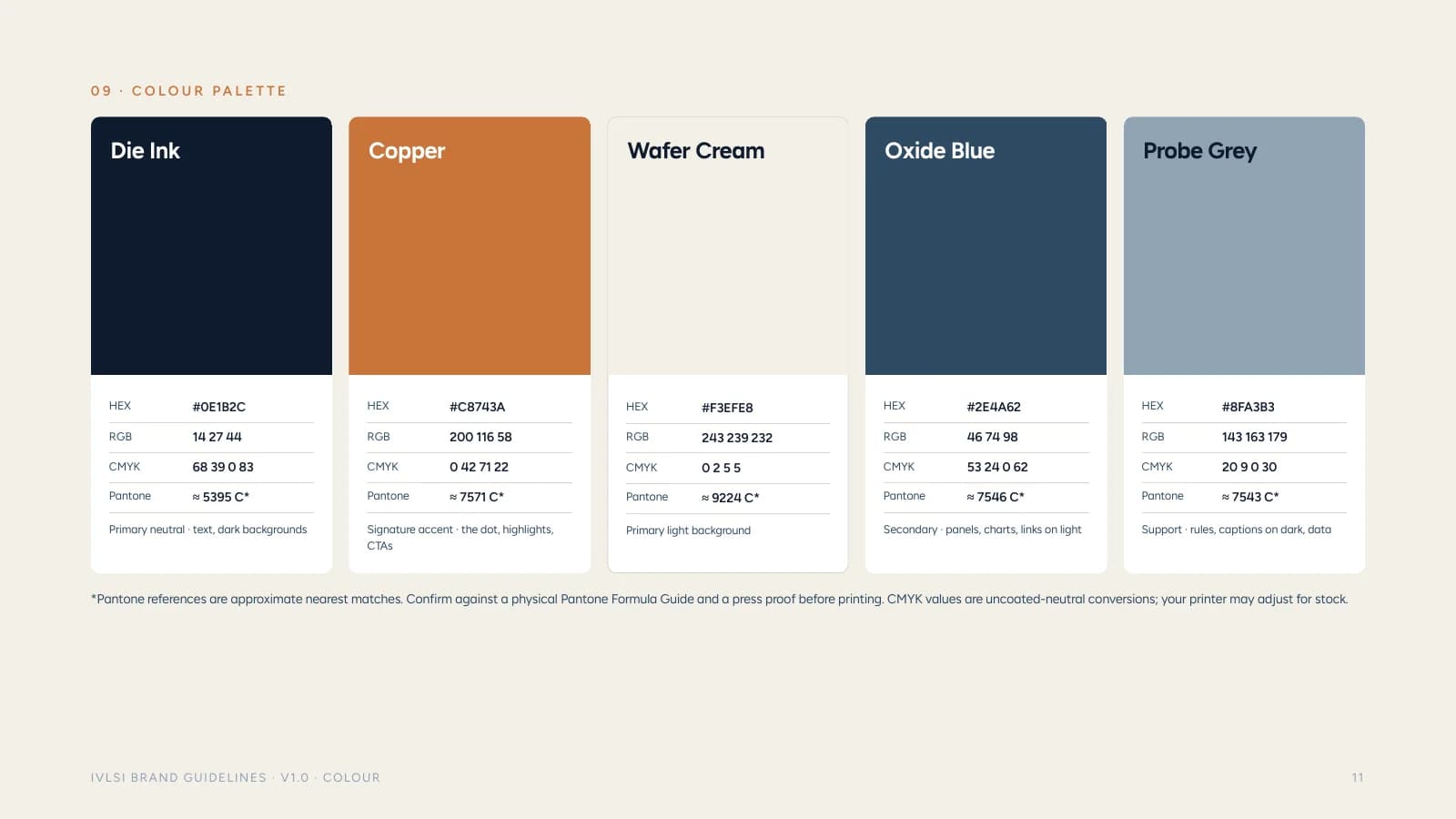
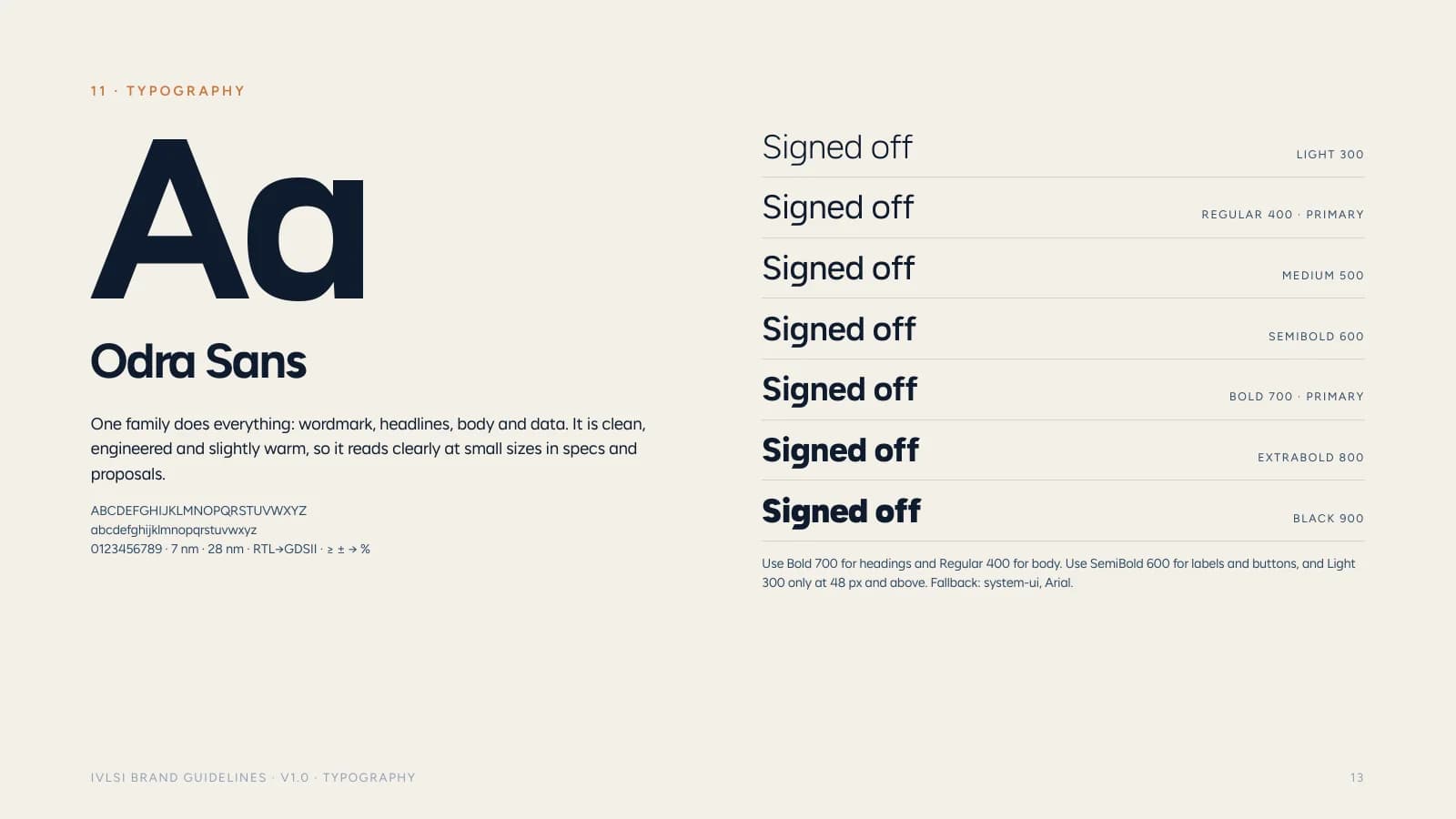
Colour and type. Copper on deep navy (#C8743A on #0E1B2C) gives the brand a precise, premium feel that's its own. Odra Sans carries everything, from the wordmark to headlines, body copy and data.
Deliverables
What we delivered.
22-page brand book
Logo system
9 logo files (primary, primary on cream, reverse, reverse transparent, one-colour, one-colour white, mark, white mark, app icon), each in SVG and PNG
3 identity concepts explored (Die, Signal Path, Wafer)
Stationery
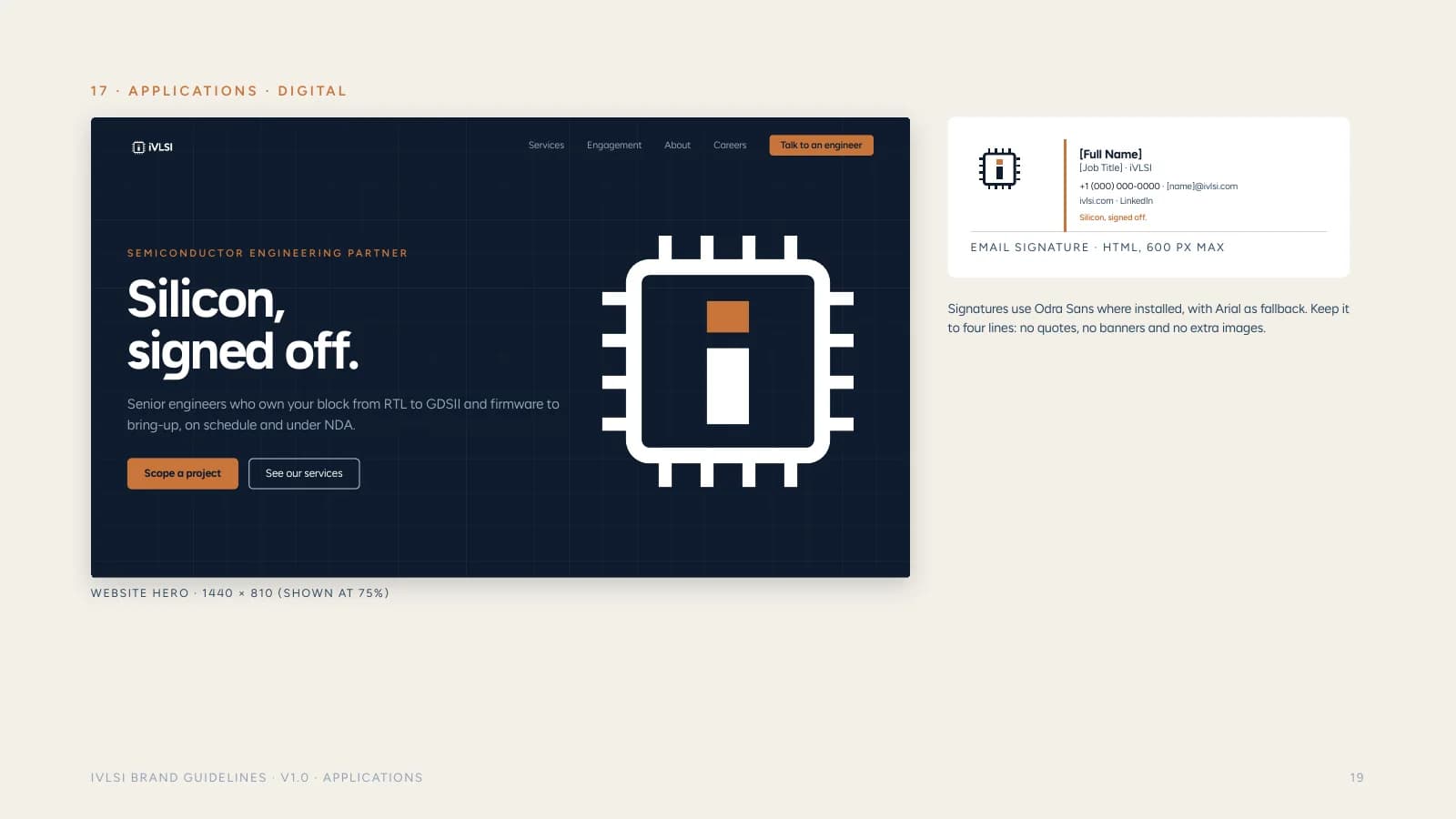
Two-sided print-ready business card, letterhead, email signature
LinkedIn banner, social post and presentation slide
Website redesign
7 page designs (Home, Services, About, Industries, Careers, Contact, mobile Home)
More work
Related brand identities.
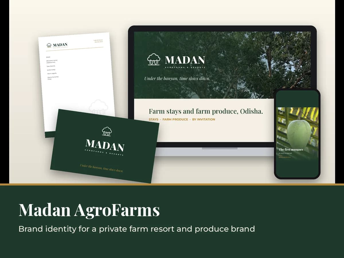
Madan AgroFarms & Resorts
A new identity for a private farm resort and its farm produce, built around a line-art banyan. Brand book, logo family, social kit, gate signage and produce labels.
Read the case study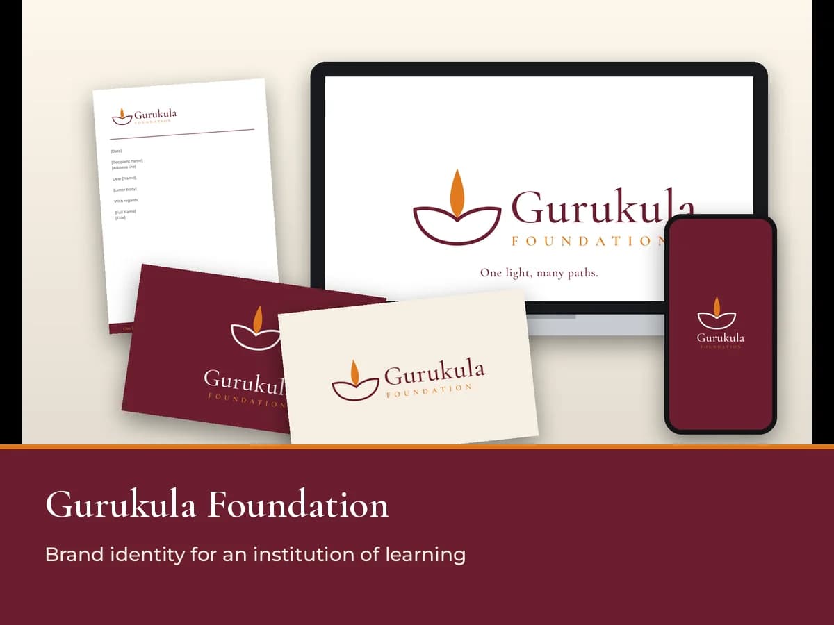
Gurukula Foundation
A new identity for an institution where engineering, nursing and management students learn under one roof, built around a diya drawn in one continuous line. Brand guidelines, logo package and web kit.
Read the case study
Next step
Does your brand undersell your expertise.
We'll help you look as capable as you are. Tell us about your business and we'll send a clear scope and quote.