Case study
Gurukula Foundation: One light, many paths.
Gurukula FoundationEducation: an institution where engineering, nursing and management students learn under one roof
Brief
The brief.
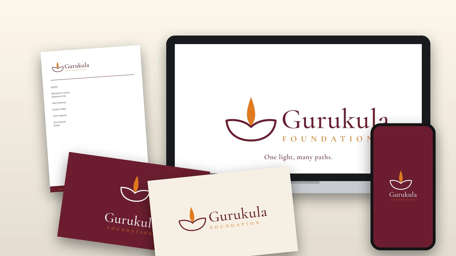
Gurukula Foundation needed a new identity for an institution that brings three disciplines together. The brief asked for a brand that feels warm rather than loud, classical rather than trendy, and confident without being grand, and that holds steady on every touchpoint, from a business card to a campus gate.
Approach
Our approach.
The idea behind the logo: the diya
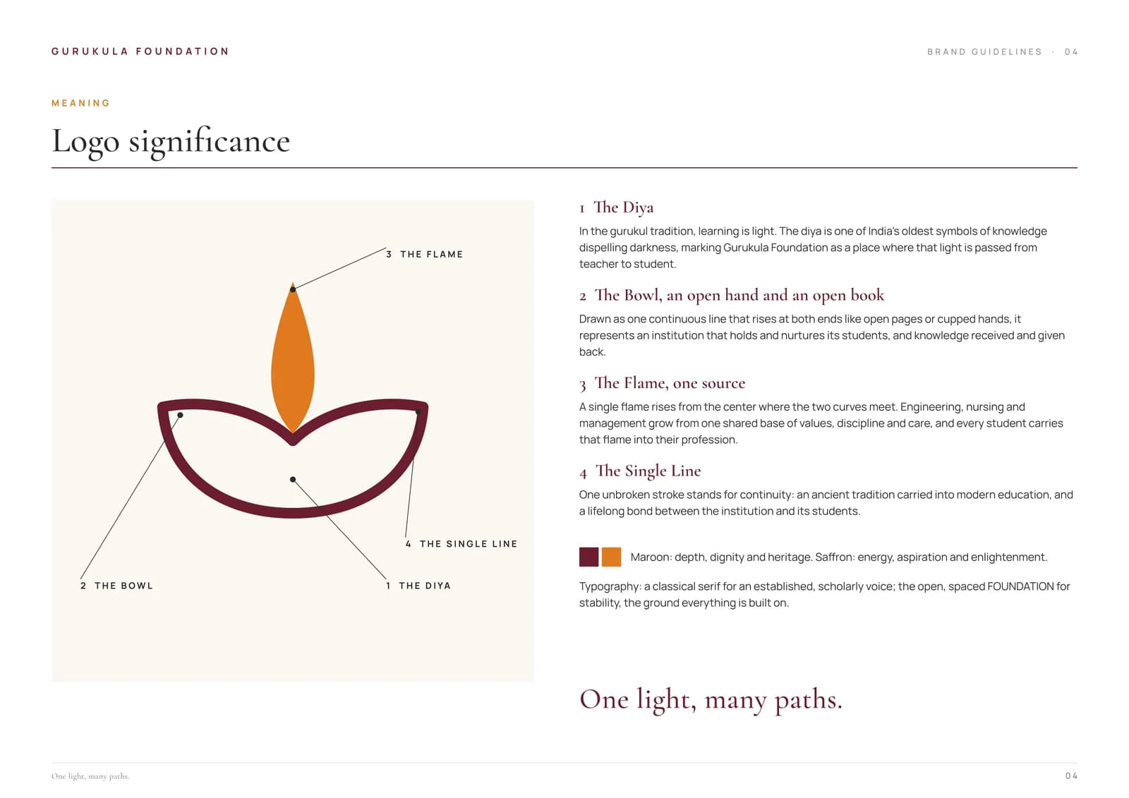
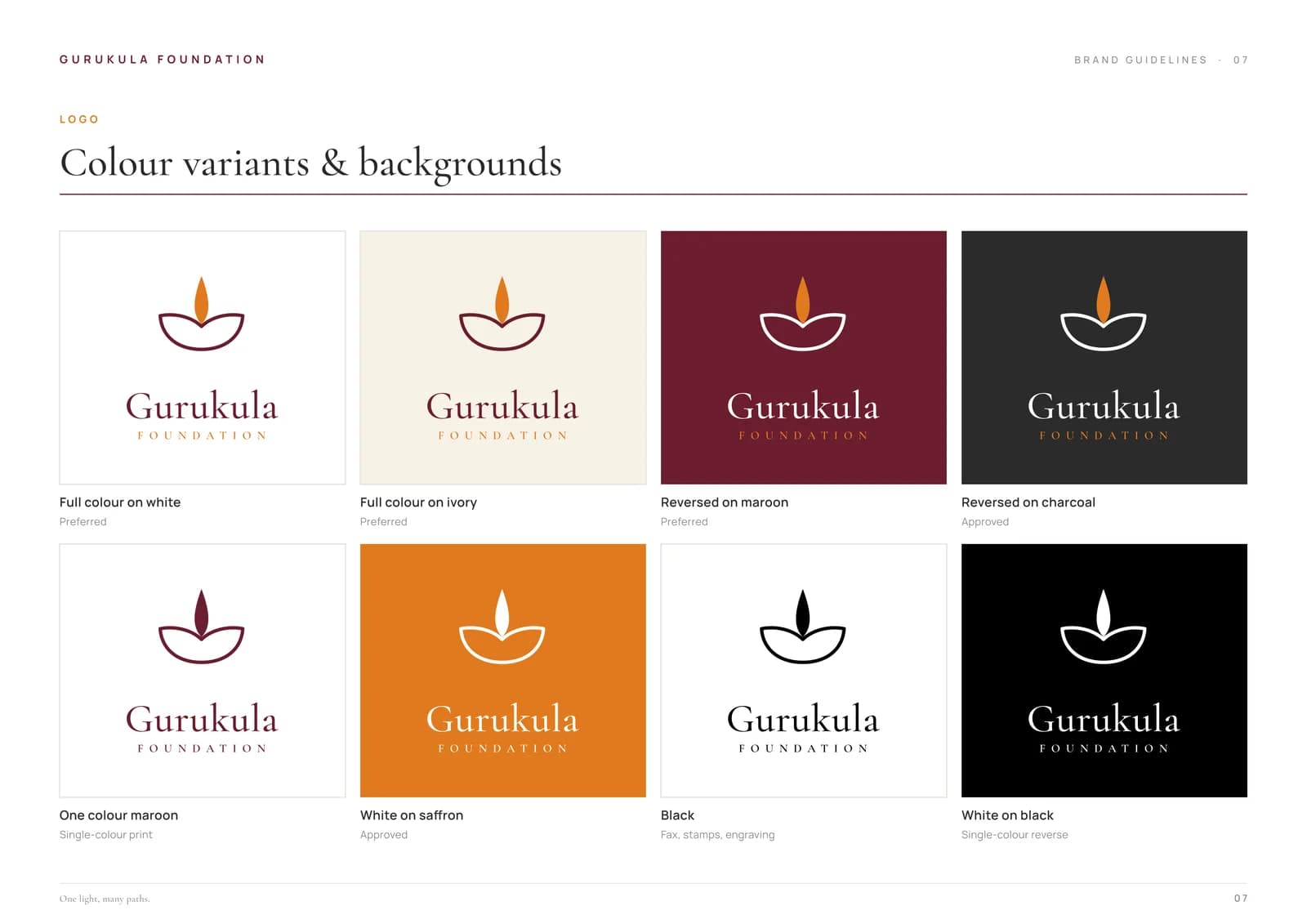
The mark is a diya, one of India's oldest symbols of knowledge dispelling darkness. Its bowl is drawn as one continuous line that rises at both ends like open pages or cupped hands, an institution that holds and nurtures its students. A single flame rises where the two curves meet: engineering, nursing and management growing from one shared base of values, discipline and care. The unbroken line stands for continuity, an ancient tradition carried into modern education.
Rooted in the gurukul idea. In the gurukul tradition, knowledge is light, and it grows when it is shared. We built the whole identity on that thought.
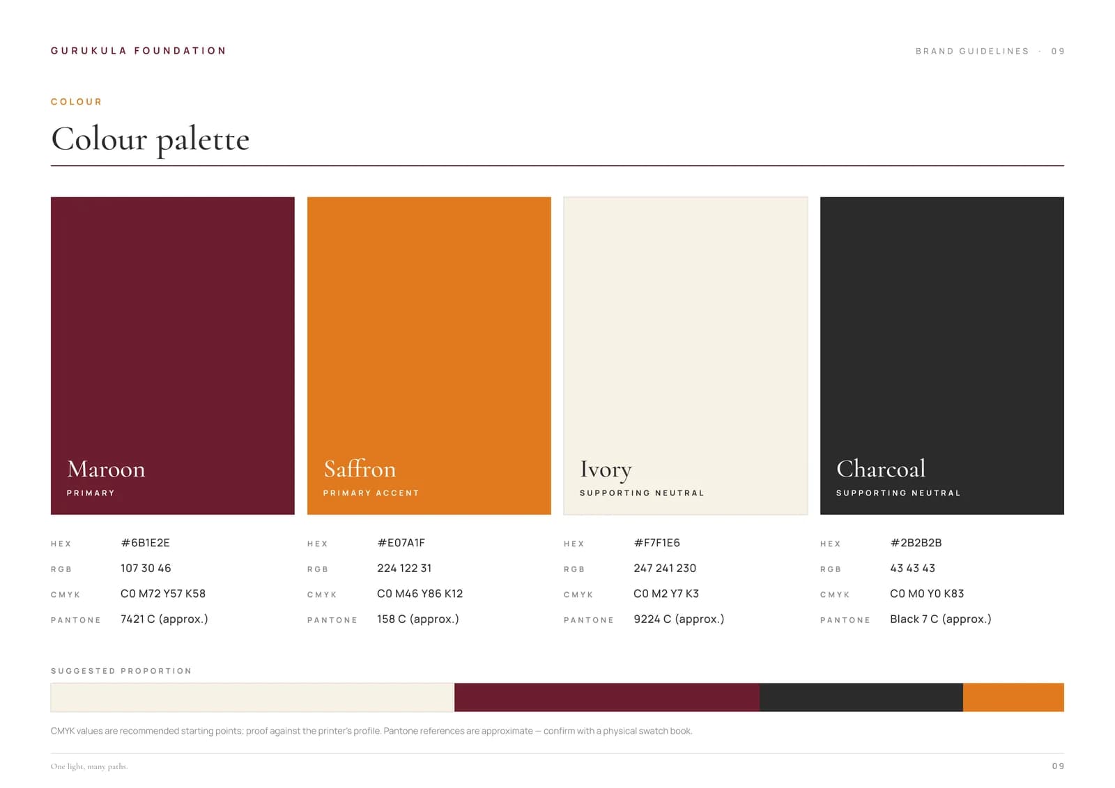
Colour, type and voice. Maroon (#6B1E2E) brings depth, dignity and heritage, and Saffron (#E07A1F) brings energy and aspiration, supported by Ivory and Charcoal. Cormorant Garamond gives the wordmark and headings a classical, scholarly voice, and Manrope keeps supporting text clear. The tone is warm, scholarly, grounded and aspirational, captured in the line "One light, many paths."
Deliverables
What we delivered.
16-page brand guidelines, plus a 2-page brand guide
Logo package
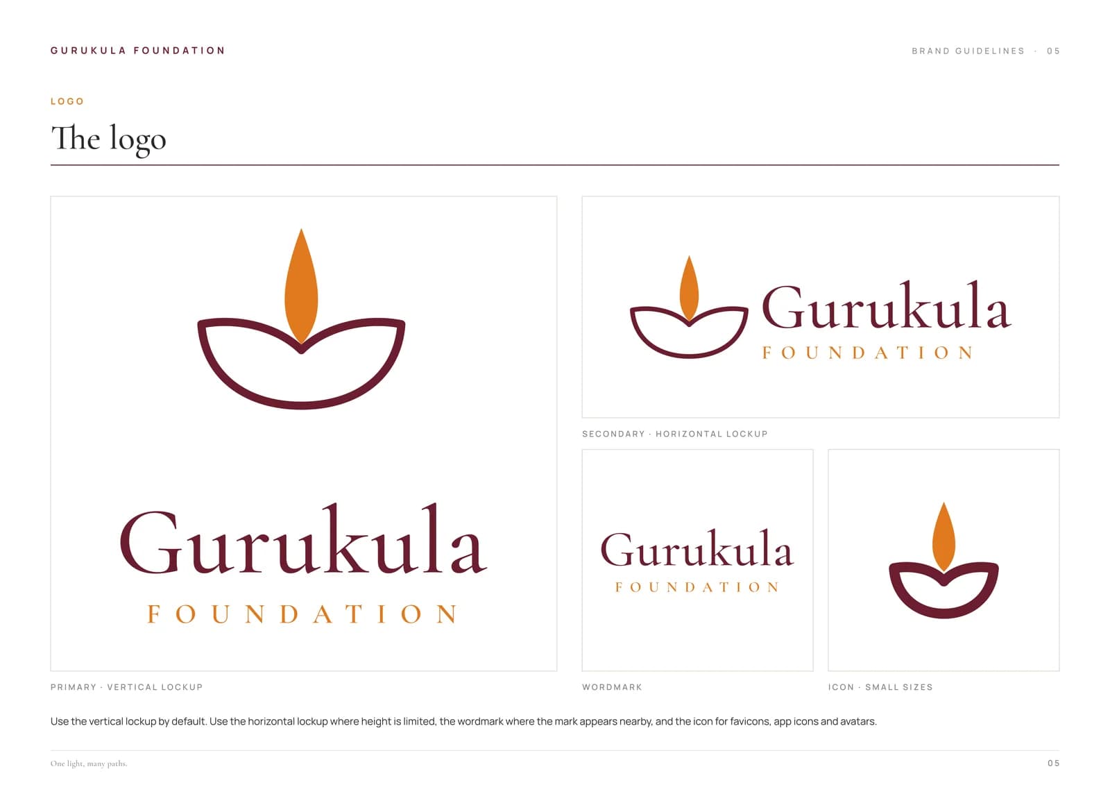
4 lockups (vertical, horizontal, wordmark, icon) in up to 5 variants (full colour, maroon, black, white, white with saffron flame), in SVG, PNG, RGB PDF and CMYK PDF
Brand sheet and logo-significance sheet
Web kit
Favicon, Apple touch icon, 512 px icon, social avatar and Open Graph image
Applications in the guidelines
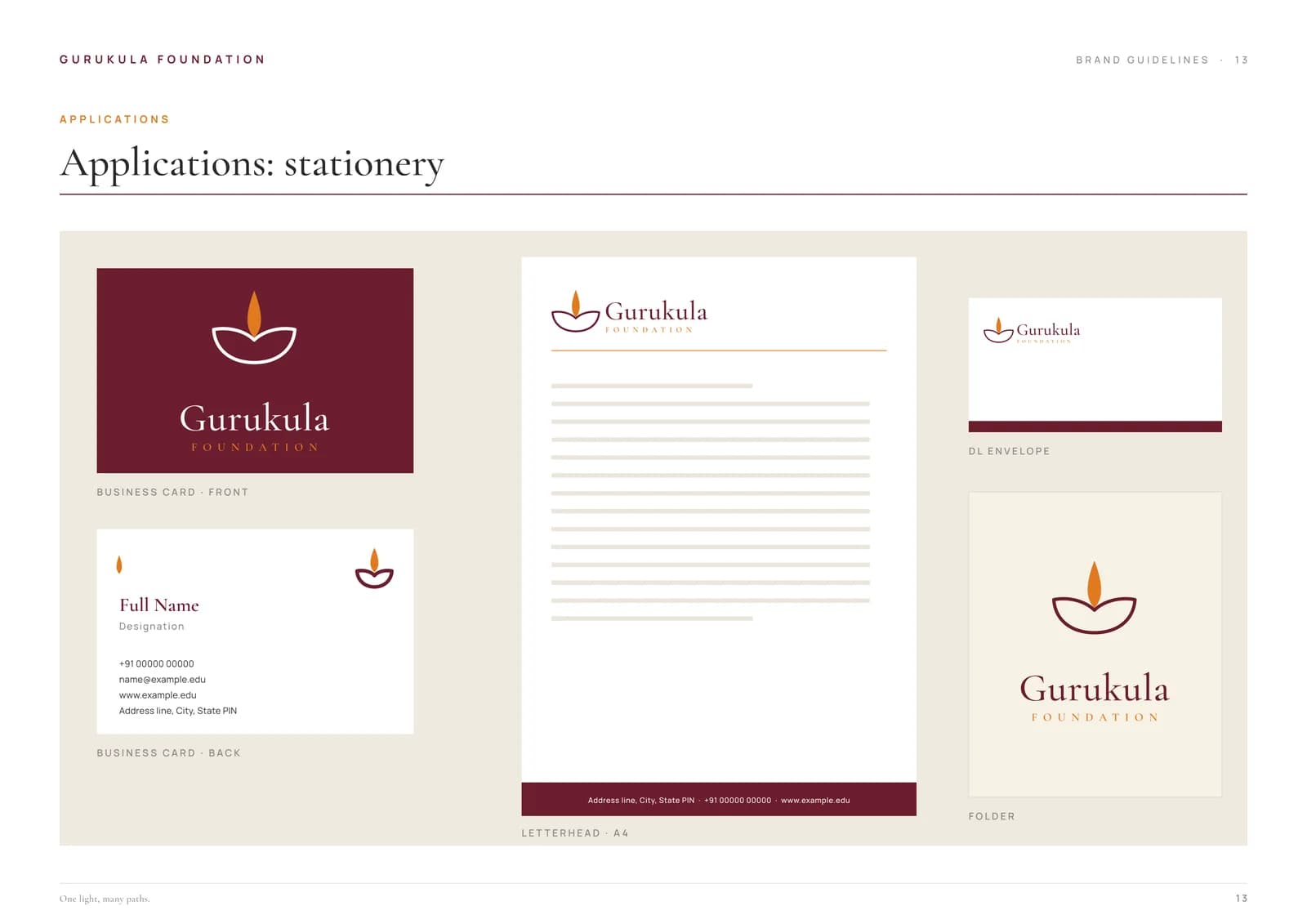
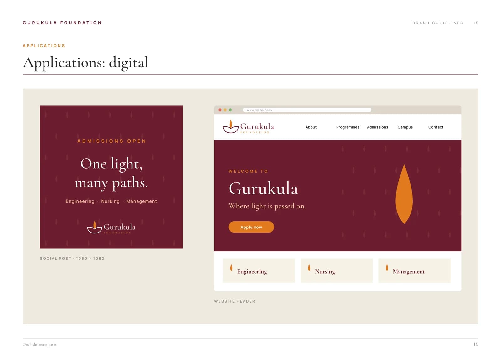
Stationery, ID and signage, and digital
More work
Related brand identities.
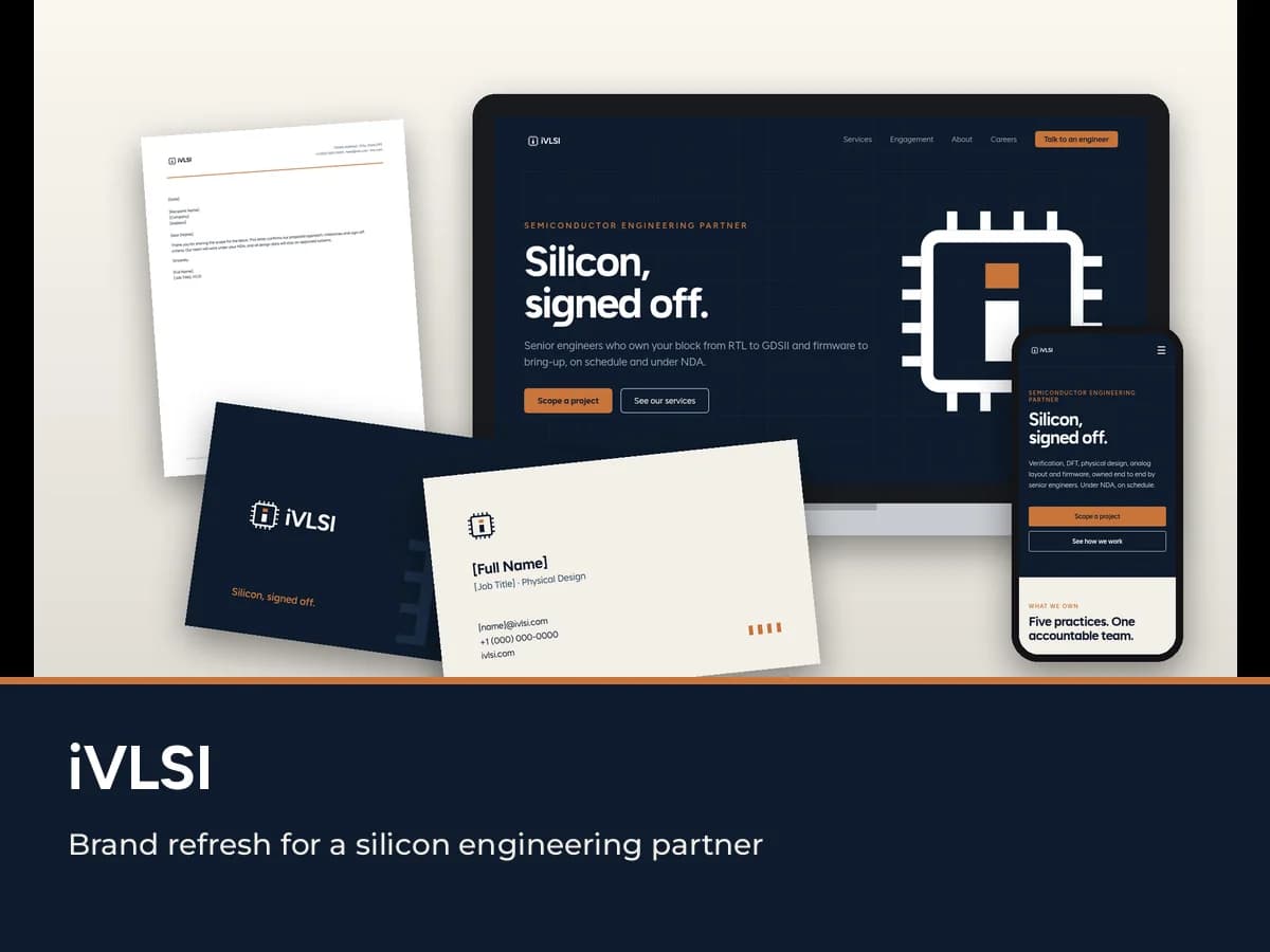
iVLSI
A brand refresh for a semiconductor engineering services company, built around the Die mark: a lowercase "i" inside a chip outline. Brand book, logo system, stationery and a website redesign.
Read the case study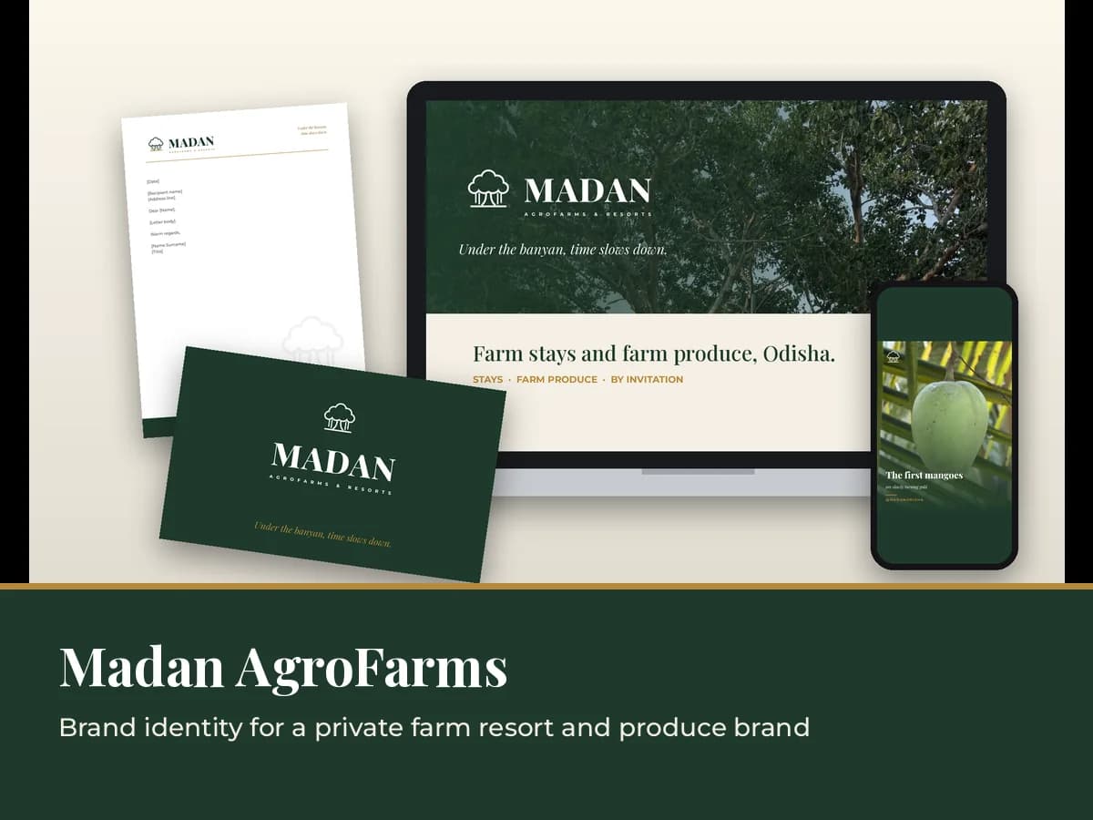
Madan AgroFarms & Resorts
A new identity for a private farm resort and its farm produce, built around a line-art banyan. Brand book, logo family, social kit, gate signage and produce labels.
Read the case study
Next step
Building a brand people will trust for years.
We design identities with meaning at their core and the guidelines to keep them consistent. Let's talk about yours.